Derecho: What are They and Can we Forecast Them

Derecho: What are They and Can we Forecast Them

It’s been a week and a half since a derecho tore across Iowa, but the evidence of this very powerful storm remains – widespread devastation to corn crops, damage to buildings, thousands still without power, many homeless. This may be the first time you’ve heard the term derecho or witnessed the power of one, and you may be thinking 2020 is of course just bringing us new meteorological hazards. But the term was first coined in the late 19th century, and they’ve been part of meteorologists’ vocabulary since the 1980s. So, what are they? Where and when do they happen? Can you prepare for the next one?

Derechos are “swaths of straight-line wind damage”

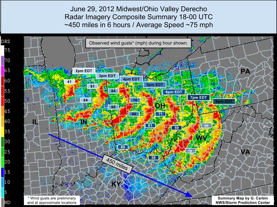
NOAA’s Storm Prediction Center has defined specific criteria that must be met for an event to be considered a derecho. First, a concentrated area of convectively induced (i.e. thunderstorm) wind gusts greater than 26 m/s (58 mph) would be observed over a major axis length of 400 km (almost 250 miles). The image below, from the National Weather Service, shows an example of a derecho in 2012. The radar imagery helps meteorologists assess the scope and structure of the event, and the numbers are the observed wind gusts during the event.

The potential winds and subsequent damage from a derecho can be equivalent to an EF-0 to EF-2 tornado (an EF-2 can have winds from 111-135 mph with considerable damage). But derechos are distinctly different from tornadoes. First they are much more widespread. And the winds associated with them aren’t necessarily rotating, which is why you may hear the term “straight-line winds.” These wind speeds are partly due to how fast the storm is traveling.

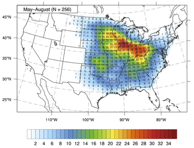
In 1998, Bentley and Mote did an analysis on the climatology of derechos. While different types of derechos can happen any time of year, they are most common in May, June, and July. They found that derechos that originate in the northern Great Plains and travel in a southeastward pattern tend to last for around 10 hours! The graphic below, from Guastini and Bosart (2016), shows where derechos are most common in the United States.

Can meteorologists predict derechos?

With each passing year, numerical weather prediction is getting better and better. But predicting the potential formation of a derecho is particularly challenging. The Storm Prediction Center and National Weather Service offices are very good at identifying areas where severe weather is likely to occur a day or two in advance. Like it’s hard to know which thunderstorm will produce a tornado, it’s difficult to know which line of storms may organize into a larger scale derecho. Once a derecho has formed, there are new challenges with forecasting its speed, strength and direction (based on the complexities of the storm itself, but also of the surrounding environment). But it has been possible to warn people several hours ahead of an advancing derecho so that precautions can be taken.

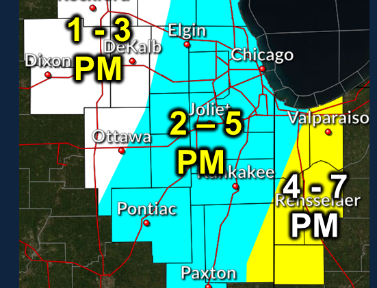
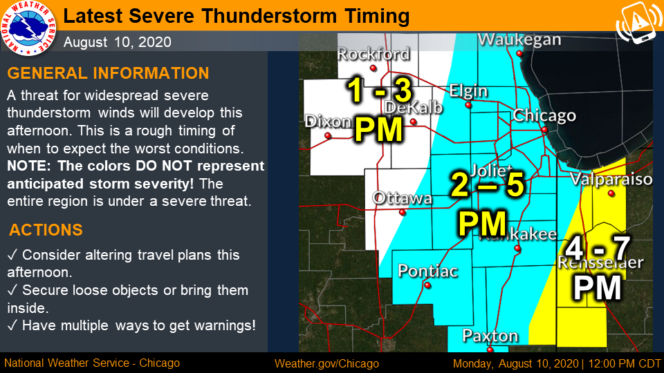
Take the August 10th derecho for example. On August 9, the SPC did not see any indication of potential for derecho development, though they did note there was marginal risk for severe thunderstorm activity associated with a cold front moving across the region. By the morning of the 10th, forecasters were aware of the developing situation and had placed eastern Iowa and northern Illinois in an area of enhanced risk for severe thunderstorms. By noon, the Chicago National Weather Service office had released this forecast of the arrival of the derecho storm, well in advance of the 2pm-5pm arrival.  See graphic below.

This is a good reminder to always be prepared for severe weather in the summer months. Check your local National Weather Service office’s website daily; keep up-to-date on the Storm Prediction Center’s maps of where the risk for severe weather is expected over the next couple of days; and get a good radar app on your phone to keep your eye on any storms headed your way (my personal favorite is RadarScope).

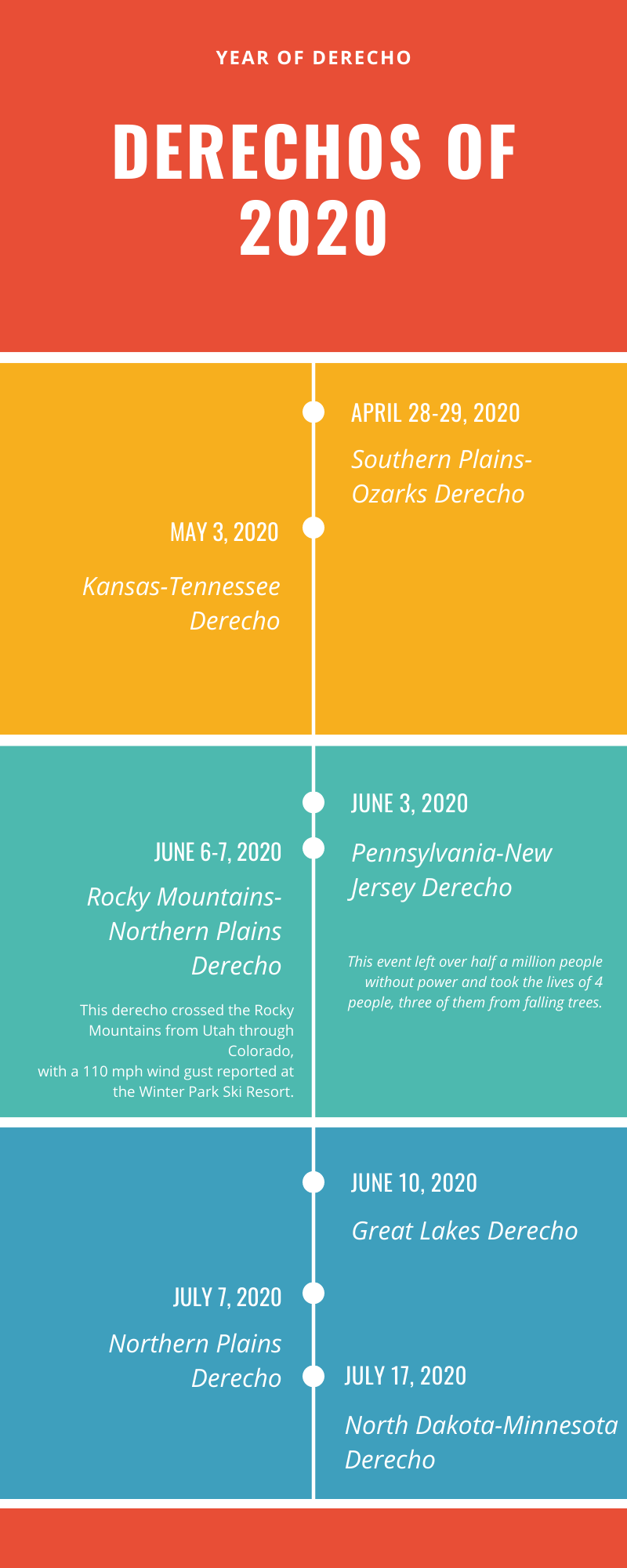
The derechos of 2020

It’s been an active year for derechos (because of course, 2020). According to Wikipedia, the following derechos have occurred this year:

April 28-29, 2020 – the Southern Plains-Ozarks Derecho

May 3, 2020 – the Kansas-Tennessee Derecho

June 3, 2020 – the Pennsylvania New Jersey Derecho – This event left over half a million people without power and took the lives of 4 people, three of them from falling trees.

June 6-7, 2020 – Rocky Mountains Northern Plains Derecho – One of the most surprising elements of this derecho was that it crossed the Rocky Mountains from Utah and through Colorado, with a 110 mph wind gust reported at the Winter Park Ski Resort. I personally remember this one as I headed to the grocery store and warned my husband and daughter to bike back to the house before the storm hit. They barely made it in time before the storm arrived, whipping through.

June 10, 2020 – Great Lakes Derecho – The below image (wind_reports.png) shows the high volume of wind reports during the event that left 700,000 people without power. It also produced 7 tornadoes across Ontario, Canada.

July 7, 2020 – Northern Plains Derecho

July 17, 2020 – North Dakota-Minnesota Derecho

August 10, 2020 – August 2020 Midwest Derecho – A complete overview of the August 10th storm can be found at the following links: NWS Des Moines, NWS Quad Cities, and NWS Chicago. The National Weather Service has been surveying the damage. They’ve shared the below picture (wind_estimate.png) with wind estimates. Based on wind damages, they’ve estimated peak wind gusts at 140mph in Linn County, Iowa. Damage has been widespread and devastating, including destruction of 250 homes and 700 sustaining significant damage, and sweeping losses of corn crops. 

What do We Talk About When We Talk About Drought? Is it Data, Impacts, or Both?

What do We Talk About When We Talk About Drought? Is it Data, Impacts, or Both?

Years from now, when we look back on 2020, drought is probably not going to be the first topic that comes to mind.

Nonetheless, in the midst of all that has been happening, drought has plagued many Americans this year. According to the latest U.S. Drought Monitor, 27% of the lower 48 is experiencing drought.

Most of this is from the 100th Meridian westward. The extreme drought category – D3 – is reserved for conditions that have a probability of occurring once every 20 to 50 years. D3 has become widespread across southern Colorado with pockets of D3 also showing up in Kansas, Oklahoma, Texas, New Mexico, Wyoming, Utah, and in Northern California and Oregon. 

What Data Indicates it’s an Extreme or D3 drought?

Each week, climatologists are looking at current data and how it compares to the long-term average.

One of the first variables we consider is precipitation. In terms of drought, one good way to evaluate precipitation is called the Standardized Precipitation Index.

This index tries to fit a location’s precipitation onto a “bell curve” distribution, where values around 0 are normal. The more negative the value, the more severe and infrequent the dry anomaly is. Here’s a look at SPI values across the country since January 1, 2020.

SPIs less than -1 can be found throughout the Northern Plains, extending south into the Texas panhandle. Starting with Wyoming and Colorado, negative SPIs can be seen heading west through Utah, Nevada, and California.

With precipitation deficits through spring and into summer, drier soils and hot temperatures followed for much of this area.

Streamflows have also dropped in the region as a result of lower snowpack in the mountains and lack of springtime precipitation in the lower elevations.

Higher evaporative demand (map below) has also plagued the region. The Evaporative Demand Drought Index (EDDI), is a way to measure how much water the atmosphere wants to take from the surface. This map of EDDI shows how anomalously high the evaporative demand was for the month of June.

In short, all of the indicators that we look at – precipitation, temperature, soil moisture, streamflow, evaporative demand, etc. – have led to a depiction of widespread drought throughout the central and western U.S., including the introduction of D3, or Extreme Drought.

"Like the tree falling in the forest, does drought occur if there is no human to record or experience it?" —Kelly Redmond, Climatologist Extraordinaire

It’s becoming increasingly important for scientists to consider the impact an event may have on humans, animals, and the ecosystem.

This takes us a step beyond just looking at the data. Think of the family that lives near a coastline that gets wiped out by a hurricane.

Doesn’t matter if the data indicated whether it was a Category 2 or Category 3 hurricane if their home is now destroyed.

Think of the commercial truck driver who’s struggling to make it through white-out conditions and strong blowing winds. Doesn’t matter to that driver if it’s not an “official” blizzard. It’s about the impacts.

Sometimes, this is harder to do with drought, because there’s not a very clear-cut beginning and ending to the event. The boundaries are never really clear. But it’s important for climatologists to adequately assess the impacts side of all extreme events, including droughts.

As of July 14, the USDA has estimated that 17% of the nation’s hay acreage, 27% of winter wheat production, and 25% of the country’s cattle inventory are experiencing drought.

The weekly crop progress report from the National Agricultural Statistics Service shows significant areas of states with short-to-very short topsoil moisture (left map below). 81% of New Mexico’s topsoil moisture is rated short to very short, and 80% for California.

The percent of pasture and range conditions that’s poor or very poor (right map below) is almost half for Colorado, 41% for Wyoming, and 62% for Oregon.

In fact, when pasture and range conditions are blended together into one index for the U.S., in the last 10 years, there’s only one year that the conditions have been worse – 2012. If you remember how bad 2012 was, you’ll know that is a big deal.

Harvesting Impact Information

These poor conditions are having a significant impact on farmers and ranchers. Here are several of the ways climatologists are finding information on impacts:

  • CoCoRaHS Condition Monitoring. CoCoRaHS (or the Community Collaborative Rain, Hail, and Snow Network) is a way for anybody to measure precipitation at their own location. CoCoRaHS volunteers can now also report on-the-ground conditions. In the last week alone, hundreds of Condition Monitoring reports have come in, including this detailed one near Mason, Texas. If you’re a CoCoRaHS observer, submit your local report today. If not, it’s easy to become a CoCoRaHS volunteer observer.
  • Through local Extension and FSA offices. Many state climate offices are in frequent contact with these county directors in their states to get a pulse on what producers in the area are currently experiencing related to climate and weather. The Colorado Climate Center, for example, has been communicating regularly with Extension and FSA during this drought. FSA County Executive Directors will send us information such as producers applying for emergency grazing, submitting Notice of Losses, or if irrigators are running out of water.
CoCoRaHS Condition Monitoring Map
Example of a Condition Monitoring Report
Example of a drought impact report from the National Drought Mitigation Center at the University of Nebraska-Lincoln

Maybe you’re wondering why you should be sharing this information with the climate and drought community.

Perhaps it doesn’t seem to make a difference? Well, the more information we gather about impacts during specific drought events, the more we can point to these risks and vulnerabilities for future events.

Perhaps this improved flow of information can provide more support for the idea that emergency response to (and assistance for) droughts should be impacts-based instead of based on the probability of occurrence of data metrics.

Reducing the Current Drought: Historically What are the Odds Drought Will Improve this May-June?

Reducing the Current Drought: Historically What are the Odds Drought Will Improve this May-June?

One of the most basic definitions of drought is a deficit of precipitation over an area. Because each location of the world has its own unique climate, we have to consider what’s “normal” for a location to assess if there’s a deficit over a time period.

Using county precipitation data, subtracted from the average for the 1981-2010 time period, the map below shows counties with a precipitation deficit greater than half an inch from January through April 2020.

Some widespread areas with deficits to note are along the West Coast, the northern High Plains, and along the Gulf of MexicoNorthern California shows the biggest deficits – many counties have accumulated over a 10-inch deficit during their wet season. Counties along the Gulf coast are showing deficits between 1 and 8 inches.

Much of the High Plains, extending from Colorado and Kansas north through Minnesota and North Dakota, have seen deficits ranging from half an inch to 4 inches. This may not seem like a lot, but the impacts of these deficits have included drying soils and slowed growth as grasslands come out of dormancy.

Chance of Drought Improvement

For the central United States, May and June rank as two of the top three wettest months of the year. West of the Continental Divide, though, they’re actually transitioning to their dry season.  Based on the current precipitation deficit map above, we wondered how likely those areas that are either in their dry or wet season could make up those deficits from earlier in the year?  In other words, if you are entering into your wet season does that mean drought will almost always improve, while if you moving into your dry season, does that mean drought will most likely get worse?

Let’s take a look…

The above map shows for every county that currently has a January-April precipitation deficit, the percent of years where the May-June precipitation could help reduce or improve that deficit. For example, 30-40% of the time (using the entire historical record: 1895-2019), counties shaded in light green have received greater than average precipitation in May-June months. So, not only did they get what is normal for May-June, they got more to offset the deficit in 30-40% of the years. Counties shaded in light or dark blue, more than 50% of the time, they were able to get enough to reduce a deficit. You can see there is a higher percentage of years that reduce deficit coinciding with the wet season locations. And dry season locations have a lower percentage of years that reduce deficits in May-June.

Chance of Drought Elimination

In the next map, we’re comparing the extent of the current deficit (Jan-Apr 2020) to the percent of years in the record that got their normal May-June precipitation, in addition to the at least the amount of the current deficit. In other words, if your county had a 2-inch deficit, and your May-June normal is 4-inches, you’d have to get 6-inches to eliminate the deficit. How often does that happen in May-June?

Many counties in the central portion of the country have had 20-40% of years where the May-June total could eliminate the current deficit. There are even a few counties with a 40-50% shot. Unfortunately, for many counties in Colorado and to the west, the percent of years that can eliminate the deficit is low. For southeast CO, this is partly due to how large the deficits are. The deficits are big enough that it is harder to eliminate. As you move west, the issue becomes the amount you can possibly get in May-June when those months are not typically a wet time of year. For counties shaded in gray (a few in southwest CO and most of California), there are no years in the record where May-June precipitation could eliminate the deficit. Basically, there is no chance (based on our 125-year record) of deficit elimination at this time.

So, we’re most of the way through May. How are these areas doing? 30-day precipitation maps show green areas that have received greater than average precipitation for the majority of May and orange/red areas have received less than average precipitation. Parts of Nebraska and areas into South Dakota and Minnesota have gotten a 1 inch or more surplus of moisture in May. That’s good news for reducing deficits. In Northern California, even though deficit elimination is almost impossible, they have gotten a surplus to help chip away at their deficits.

For areas of Utah and Colorado that have built up deficits, they’ve unfortunately seen an increase in deficits for May. Instead of deficit reduction, their deficits have increased by 1 to 2 inches. That’s going to make it harder to reduce or eliminate.

In the last few days we’ve seen some decent moisture over the central U.S. and should help those Jan-Apr deficits.  Unfortunately areas in western CO, Utah, and west into California will mostly missed out on the precipitation. There is hope though on the 8-14 day outlook, which shows an increased chance of above average precipitation in these areas. As for the month of June, there’s a lot of uncertainty about what could possibly happen. For areas in a deficit, it’s likely that you will experience some hot and dry days. And, as is typical with summer, expect thunderstorms to boost moisture in some locations and skip out on other locations.

90-Degree Days or Here Comes Summer

90-Degree Days or Here Comes Summer

The impending heat of summer means the start of 90° days for some; for others it’s the continuation of the heat that’s already started. Let’s take a closer look at where we see those 90° temperatures – up until now, and into the first month of summer (June).

Although June 21 is considered by many to be the start of summer (with the occurrence of the summer solstice), meteorologists and climatologists consider the beginning of June to be the beginning of summer. A closer look at the climatological data, and you might be able to figure out why.

Average maximum temperatures in June are largely between 70° and 90° for most of the country (maroon dots). For the desert southwest, most of Texas, and the southeast, average maximum temperatures are mostly over 90° (pink dots). For isolated locations in the north, the Pacific Northwest, and some high elevation locations of the Rockies, average June maximum temperatures stay below 70° (yellow dots). Looking at this map, it seems it could be a useful tool in helping those in the south know where to go to cool off for the summer!

Despite the fact that most of the country averages temperatures below 90° in June, many of these locations will actually see their first 90° day in – you guessed it – June. Check out this map that shows stations that typically observe their first 90° day in June. Pretty much all of the locations that don’t average temperatures above 90° will still see a 90° day this month.

While a lot of these areas in gray are anticipating their first really hot day of the year, there are other areas that have already become familiar with the heat. This last map shows the number of 90° days already experienced across the country. Not surprising that most of the regions that average very hot temperatures in June have already seen several 90° days before the official start of summer. Following a line around Interstate-10 from southern CA all the way to Florida, many stations have observed more than ten 90° days. Some of these hot days have even extended north into the High Plains and the Midwest.

90° is a pretty important metric for determining how “hot” a location is. At 90°, vegetation begins to show signs of stress. It’s widely considered fact that the growth of some crops is inhibited during these hotter days. When the temperature tops out above 90°, heat stress is also more common for people and animals. Over the last couple of decades, summer trends have seen an increasing number of these very warm temperatures. For example, in Colby, Kansas, average number of 90° days has increased from around 50 in the 1970s to around 60 in the 2010s. On a positive note, thanks to increased irrigation through many areas of the High Plains, the number of 90° days has actually decreased (take Seward, Nebraska for example). Still, it’s safe to assume that we’ll have a number of uncomfortable days ahead of us as we head into summer. Be prepared, and find ways to help your family (and your livestock!) keep cool on those particularly hot summer days.

Share on facebook
Share on google
Share on twitter
Share on linkedin
Share on pinterest

Timing is Everything and The Death of Average in 2019

Timing is Everything and The Death of Average in 2019

Have you been noticing quite a bit of precipitation lately? You’re not alone if you’re feeling rather water-logged this spring. Check out the latest U.S. Drought Monitor map (left map below) and you’ll see record low drought across the Contiguous United States.

Need a river perspective?  Check out the USGS Streamgage Network (right map below) and you’ll see rivers across the middle of the country busting at the seams.

Precipitation in Amarillo

Weather people will generally say conditions are “wetter than average,” but what does that even mean? Wetter than average can mean extremely different things for different locations. It can also mean very different things at different times of year.  Consider, for example, the seasonal cycle of precipitation at Amarillo, TX. In February, the driest month of the year, average precipitation is usually just over half an inch (0.5”). With just a quarter inch deficit for the month, they’d be at 50% of average, which sounds dreadful, but isn’t too bad and it certainly can be made up during the “wet” time of the year.  Consider another scenario: what if Amarillo got an extra 1” of precipitation in February?  Suddenly, they’d have 279% of average precipitation. But in terms of total contribution to the water they get, pretty small: it’s still only 8% of their annual average. Big things just don’t tend to happen in a dry month.

Now consider a wet month in Amarillo – June. They normally get over 3” of precipitation, or about 16% of their annual average of 20.36”. Now a 50% of average June would mean a 1.5” deficit, which is not as easy to make up. Get 200% of average in June, and you’re at a 3” surplus and 31% of your annual total. You could have a really dry February, and easily make up the deficit with just a tiny bit above average in June. As they say: timing is everything.

The Death of Average in 2019

So, what’s been going on this spring? Check out the below map that shows locations that either expect to be “wet” or “dry”, climatologically speaking, in April. Most of the middle of the country doesn’t really lean either way. Track along the Mississippi valley from St. Louis down toward Louisiana and we see April is normally a wet time of year. That area of Ark-La-Miss (southern Arkansas, northern Louisiana, and Mississippi) just happened to get hit with much above average precipitation in April.

Now check out the locations in May that expect to be “wet” and “dry” in May. Much of the country, including the majority of the Great Plains, start seeing their wet season in May. Areas of east Texas and up into Oklahoma and Kansas have been pummeled with frequent storms in the past few days. Add to that the Northern Plains getting hit with heavy storms in March and the middle of the country is having a hard time drying out.

This final map shows the % of the annual precipitation that has fallen from April 1 – May 21 this year across the U.S.  Use your mouse to see percentages for specific locations.

Concentrate on the areas with light and dark green dots: In the past 50 days, these locations have received 30-60% of the total amount of precipitation they usually receive for the whole year! The wide swath extends from central Texas north into Oklahoma and Kansas, and east into Louisiana and Arkansas. For these areas, we’re talking a water surplus of 8-12”!

The Takeaway

The takeaway message is that it’s going to take some time for things to return to normal and for the soils to dry out a bit. Temperatures have unfortunately not been a help. With mostly widespread cooler than average temperatures over the past 60 days, evaporative losses have been less than average, further inhibiting the “drying out” of these locations. Additionally, June and July continue the climatological wet season. So, for now, the trend looks to continue into the near future.

Share on facebook
Share on google
Share on twitter
Share on linkedin
Share on pinterest

The Surprising Frequency of Deadly Spring Snowstorms

Most of us who live in the Upper Midwest and High Plains already know that, even after spring has started, there is still a risk for winter to rear its ugly head again. But how often do significant snowfall events happen in April and May?

In mid-April, another powerful storm system made its way across the plains, bringing strong winds, snow, and blizzard conditions from areas just east of the Rockies all the way to the Great Lakes and Ohio River valley. According to NOAA’s National Centers for Environmental Information, three different stations in South Dakota broke their daily snowfall records for April 10. While snow in April may have sounded surprising to some, this is not the first time a large April storm has blanketed the plains in white.

Snowfall analysis of the April 2013 storm that hit the Northern Plains

Consider this example, back in April 2013, areas in Montana, Wyoming, Colorado, and east through the Dakotas, Nebraska, and into Minnesota received between 2-10″ from the 15th to the 18th. Several other springtime examples have brought devastation to livestock producers.  Most remember 1997 and the early April blizzard in North Dakota that hit in the middle of calving.  The storm killed an estimated 100 thousand head of cattle, most of those being calves and yearlings.  In 1966, a March storm hit a similar area in North Dakota and Minnesota.  That storm unleashed 70mph winds and resulted in drifts of 30 to 40 feet killing approximately 20 thousand head of cattle.

Average April high temperatures across the north and High Plains typically reach above 50°F. But it’s still quite easy for troughs of strong low pressure to pass through the region and bring temperatures down to well below freezing. Consider Scottsbluff, Nebraska, where average high temperatures are over 60°F after April 10, and average low temperatures warm up above freezing by April 19. And yet, each year, Scottsbluff sees colder than freezing temperatures an average of 5-10 days from mid-April through May.

Average amount of snowfall for the Plains in April and May

According to data from the Midwestern Regional Climate Center, long-term average snowfall after April 15 totals more than an inch along the Colorado Front Range, throughout most of Wyoming and Montana, and across the Dakotas. Snow in late spring is a given.

One to two inches of snow in the spring isn’t really associated with major impacts. But crops and livestock can be sensitive to a larger accumulating event. The Midwestern Regional Climate Center has an archive of Snow Climatology Maps, where a user can look up averages and different snow statistics across the country for every month of the year.

Even in May, the risk of large accumulating snowfall events still exists. Some stations in the Midwest have seen 6” of snowfall at least once in May. A few locations in the Dakotas, Montana and Wyoming have experienced between two and five days of 6” snowfall events in May.

What we’ve experienced this spring is a good reminder that spring doesn’t always mean thunderstorms, warmer temperatures, and blooming flowers. Snow, winds, blizzards, and cold temperatures can and do occur. Assessing your risk for these events, as well as paying close attention to the weather forecasts, can help you prepare and minimize the impacts.